1. STORY OF THR RECYCLING LOGO
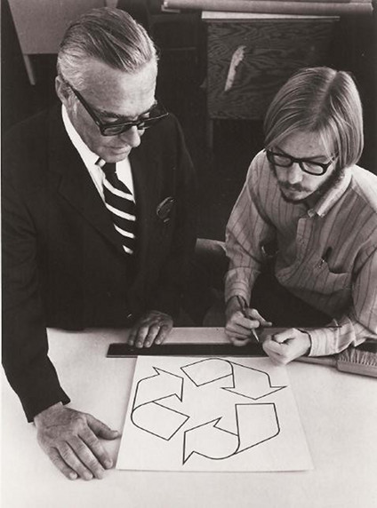
In 1970, Gary Anderson was a 23-year-old college student at the University of Southern California, when a Chicago container company held a design contest to raise awareness about the environment. Anderson’s submission won, and it became the internationally recognized recycling logo–and a design classic that ranks with the Coca-Cola and Nike marks, for sheer ubiquity.

2. THE CONCEPT: Financial Times Magazine ran a first-person retrospective in which Anderson recounts the experience:
“It didn’t take me long to come up with my design: a day or two. I almost hate to admit that now. But I’d already done a presentation on recycling waste water and I’d come up with a graphic that described the flow of water: from reservoirs through to consumption, so I already had arrows and arcs and angles in my mind.
The problem with my earlier design was that it seemed flat, two-dimensional. When I sat down to enter the competition, I thought back to a field trip in elementary school to a newspaper office where we’d seen how paper was fed over rollers as it was printed. I drew on that image – the three arrows in my final sketch look like strips of folded-over paper. I drew them in pencil, and then traced over everything in black ink. These days, with computer graphics packages, it’s rare that designs are quite as stark.”

3. GARY ANDERSON:
Despite a clear talent for the medium, Anderson actually became an architect rather than a graphic designer, and ironically learned to lament environmental regulations from time to time. But I won’t spoil the whole story here. Check out the full account on the Financial Times. Then remind yourself; you may become most well known for the work by which you’d prefer not to define your career. (And you may make all of $2,500 for it.)
http://en.wikipedia.org/wiki/Gary_Anderson_(recycling)
http://www.ft.com/
http://en.wikipedia.org/wiki/Recycling_symbol
