The high-design lighting retailer Flos has partnered with Bio-on, an Italian biotech company, to reissue an iconic plastic lamp in eco-friendly bioplastic. Flos says Philippe Starck’s new Miss Sissi lamp is the world’s first design object manufactured with Continue reading “MISS SISSI FLOS LAMP”
Category: MARKETING & COMMUNICATION
LULU GUINNESS FOR UNIQLO
Lulu Guinness’ debut collection for Uniqlo officially launches today – the designer’s first ever apparel offering. The range will feature a selection of 14 T-shirts, each bearing Guinness’ most iconic prints – from doll faces to red-lipped pouts. Continue reading “LULU GUINNESS FOR UNIQLO”
FINALLY GOOGLE DRIVE CLOUD-STORAGE SERVICE
After weeks of rumors, Google has finally launched GOOGLE DRIVE its Cloud-Storage service. Like Microsoft SkyDrive, Dropbox and Amazon Cloud Drive, the service syncs users’ offline files with an online storage space that can be accessed from anywhere.
Continue reading “FINALLY GOOGLE DRIVE CLOUD-STORAGE SERVICE”
AFTER STEVE JOBS TRIBUTE HONG KONG STUENT DESIGNS COKE IMAGE
Hey, remember that kid who designed the iconic Apple logo incorporating Steve Jobs’ silhouette after the tech icon’s death? He’s back. Hong Kong-based design student Jonathan Mak Long has designed a new logo for Coca Cola, after being approached by Continue reading “AFTER STEVE JOBS TRIBUTE HONG KONG STUENT DESIGNS COKE IMAGE”
STORY OF THE RECYCLING LOGO DESIGN BY GARY IN 1970
1. STORY OF THR RECYCLING LOGO
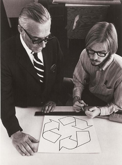
In 1970, Gary Anderson was a 23-year-old college student at the University of Southern California, when a Chicago container company held a design contest to raise awareness about the environment. Anderson’s submission won, and it became the internationally recognized recycling logo–and a design classic that ranks with the Coca-Cola and Nike marks, for sheer ubiquity.

2. THE CONCEPT: Financial Times Magazine ran a first-person retrospective in which Anderson recounts the experience:
“It didn’t take me long to come up with my design: a day or two. I almost hate to admit that now. But I’d already done a presentation on recycling waste water and I’d come up with a graphic that described the flow of water: from reservoirs through to consumption, so I already had arrows and arcs and angles in my mind.
The problem with my earlier design was that it seemed flat, two-dimensional. When I sat down to enter the competition, I thought back to a field trip in elementary school to a newspaper office where we’d seen how paper was fed over rollers as it was printed. I drew on that image – the three arrows in my final sketch look like strips of folded-over paper. I drew them in pencil, and then traced over everything in black ink. These days, with computer graphics packages, it’s rare that designs are quite as stark.”
3. GARY ANDERSON:
Despite a clear talent for the medium, Anderson actually became an architect rather than a graphic designer, and ironically learned to lament environmental regulations from time to time. But I won’t spoil the whole story here. Check out the full account on the Financial Times. Then remind yourself; you may become most well known for the work by which you’d prefer not to define your career. (And you may make all of $2,500 for it.)
http://en.wikipedia.org/wiki/Gary_Anderson_(recycling)
http://www.ft.com/
http://en.wikipedia.org/wiki/Recycling_symbol

